Top Color Schemes for Small Living Rooms
Choosing a color scheme for a small living room can feel like a high-stakes decision. The right colors can make a compact space feel open, airy, and full of personality, while the wrong ones can leave it feeling cramped and uninspired. Fortunately, you don’t need to be a design expert to get it right. With a little color theory and some strategic thinking, you can create a beautiful backdrop that maximizes both space and style.
This guide will explore the top color schemes that work wonders in small living rooms. From timeless neutrals to bold, moody hues, we’ll provide the inspiration you need to paint your way to a more spacious-feeling home. Prepare to discover the perfect palette that reflects your taste and transforms your living area.
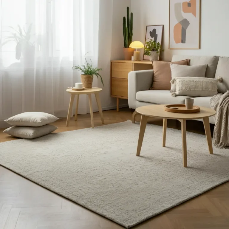
The Power of Light and Bright Neutrals
It’s a classic rule for a reason: light colors are your best friend in a small space. Shades of white, cream, and pale gray are excellent at reflecting natural and artificial light, which instantly makes a room feel larger and more open. This approach creates a clean, serene canvas that you can build upon with furniture and décor.
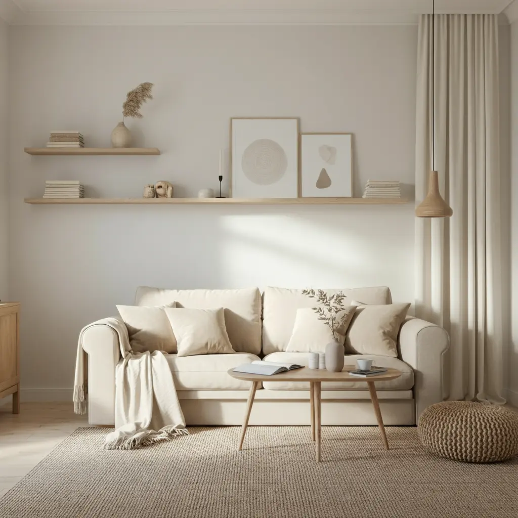
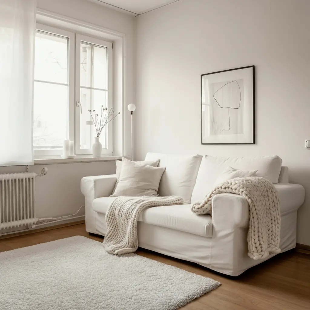
All-White for a Minimalist Feel
An all-white living room is the ultimate space-enhancer. It blurs the lines where walls end and ceilings begin, creating a seamless, expansive effect. To prevent the room from feeling sterile or cold, layer in different textures. Think of a plush wool rug, a linen sofa, a chunky knit throw blanket, and raw wood accents. These elements add warmth and visual interest without breaking the clean, bright aesthetic.
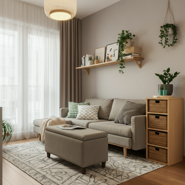
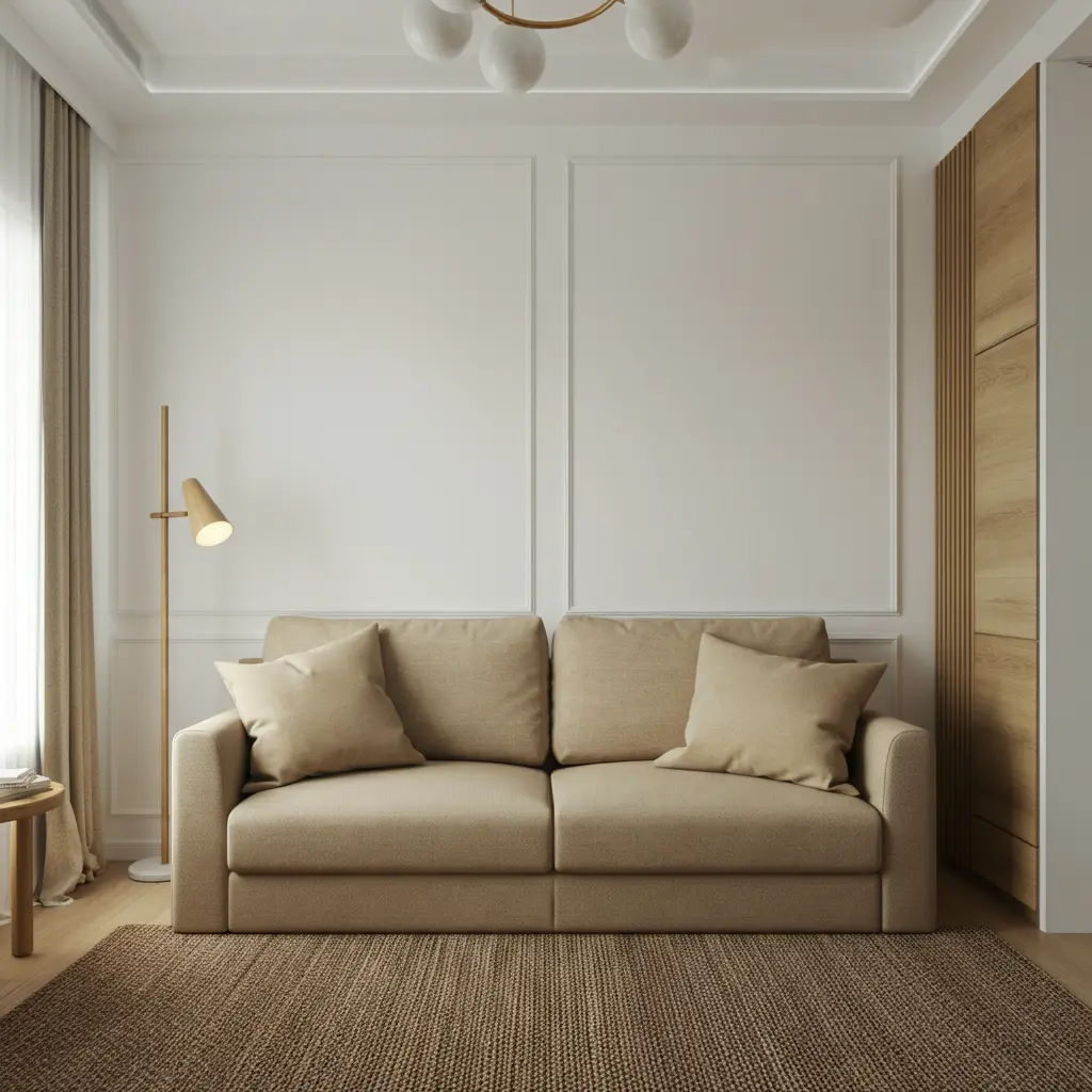
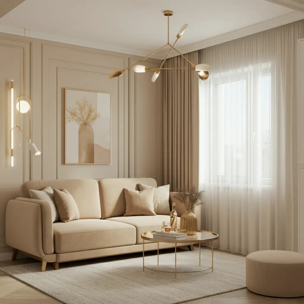
Warm Creams and Beiges
If stark white feels too clinical, consider warm neutrals like cream, ivory, or beige. These colors have soft undertones that create a cozy and inviting atmosphere. They provide the same light-reflecting benefits as pure white but with a gentler, more welcoming feel. Pair these shades with brass or gold accents for a touch of elegance and warmth.
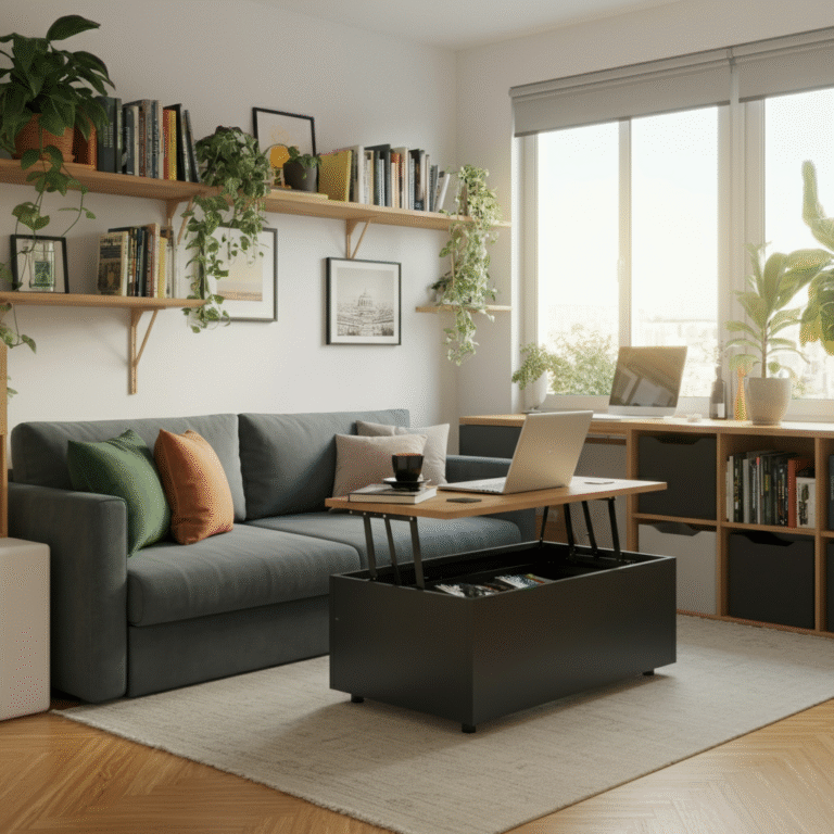
Embrace Monochromatic Cool Tones
A monochromatic scheme uses different shades, tones, and tints of a single color. This technique creates a sophisticated and cohesive look that can be surprisingly effective in a small living room. Cool tones, such as blues and greens, are particularly good at creating a sense of depth.
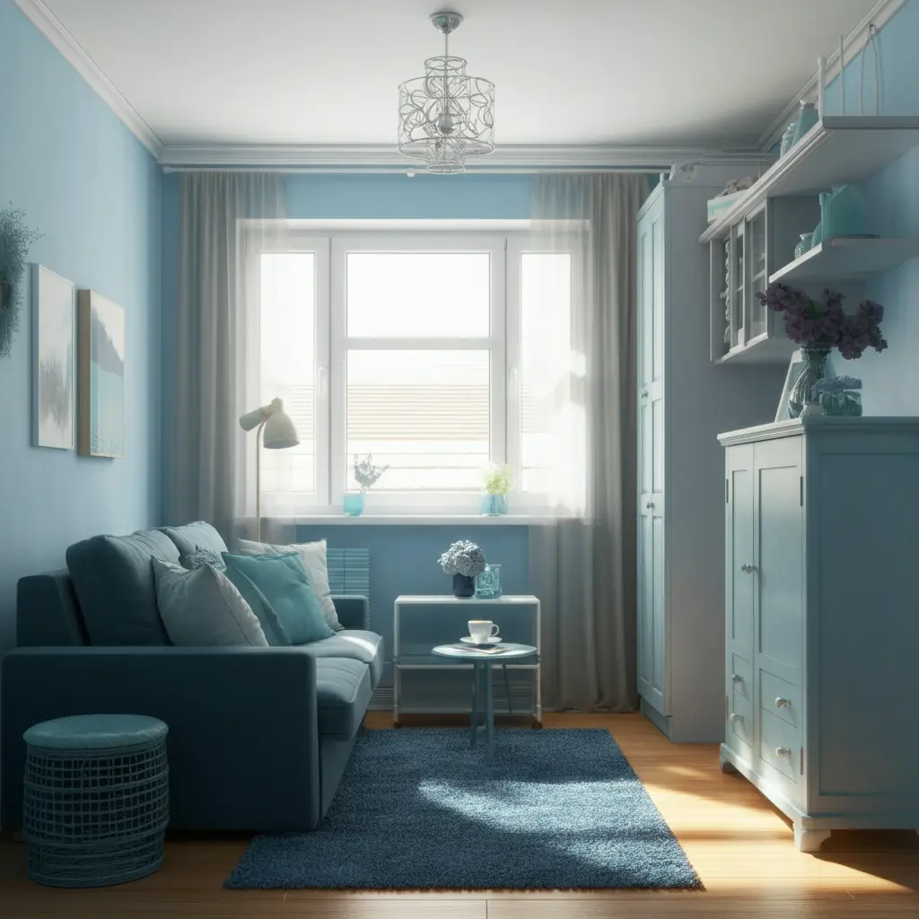
Soothing Blues for Depth and Calm
Shades of blue are known for their calming properties and their ability to make a space feel larger. Lighter blues, like sky or powder blue, create an airy, tranquil vibe. For a more dramatic and modern look, consider a mid-tone blue-gray. Painting the walls, trim, and even built-in shelving in the same shade of blue creates an uninterrupted visual plane that tricks the eye into seeing a more expansive space.
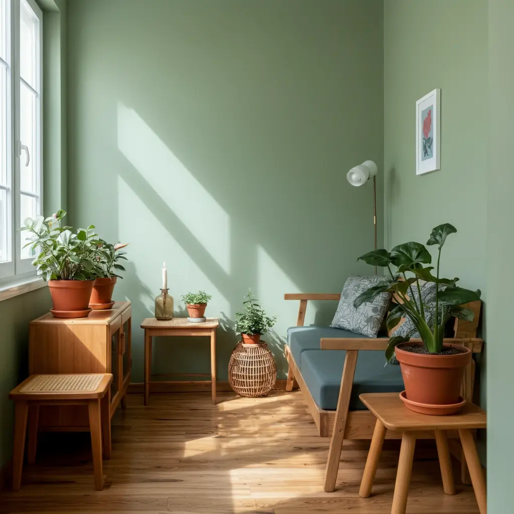
Earthy Greens for a Natural Vibe
Bring the outdoors in with a palette of soft, earthy greens. Colors like sage, moss, and mint green connect your living room to nature, promoting a feeling of peace and serenity. These shades work beautifully with natural materials like wood, rattan, and jute. A monochromatic green scheme feels both fresh and sophisticated, making the room a true sanctuary.
The Surprising Impact of Dark and Moody Colors
It might seem counterintuitive, but dark colors can be a brilliant choice for a small living room. Instead of trying to make the room feel bigger, this strategy leans into the coziness of the space, creating an intimate and dramatic jewel-box effect.
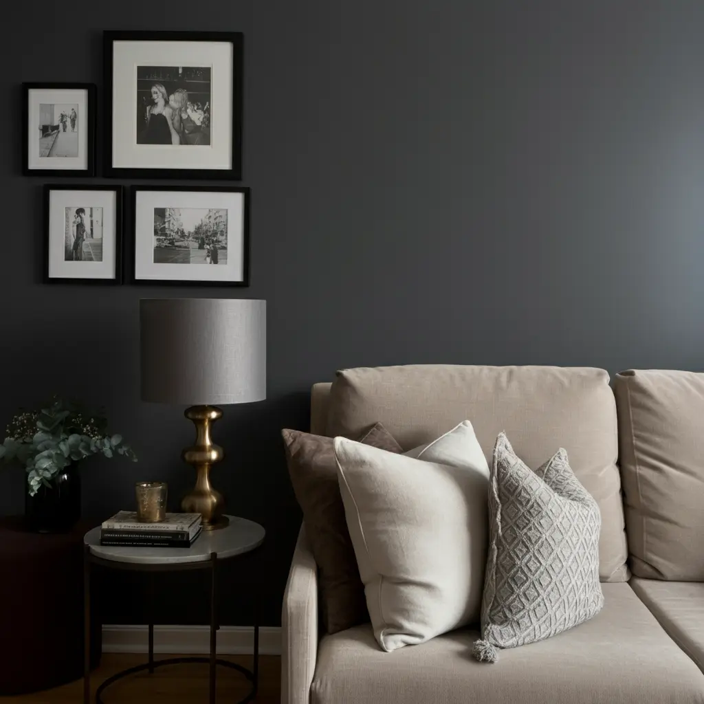
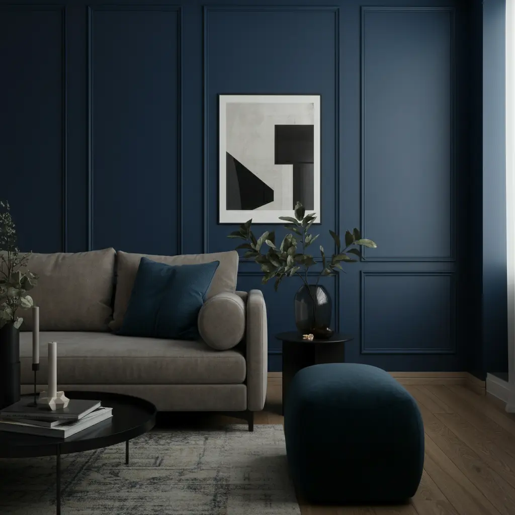
Bold Charcoal or Navy
Deep colors like charcoal gray, navy blue, or even a dark emerald green can make the walls of a small room recede. This is especially true in the evening under soft, ambient lighting. The dark walls blur the room’s corners and boundaries, creating a sense of infinite space and intimacy. To balance the dark walls, use lighter-colored furniture, a bright piece of oversized art, and reflective surfaces like mirrors and metallic décor.
Tone-on-Tone for a Luxurious Feel
Commit to the moody look by painting everything—from the walls and trim to the ceiling—in the same dark shade. This tone-on-tone approach is incredibly chic and eliminates visual clutter. It creates a seamless, enveloping feel that is both dramatic and comforting. This works exceptionally well in rooms that don’t get much natural light, as it turns a potential negative into a stylish positive.
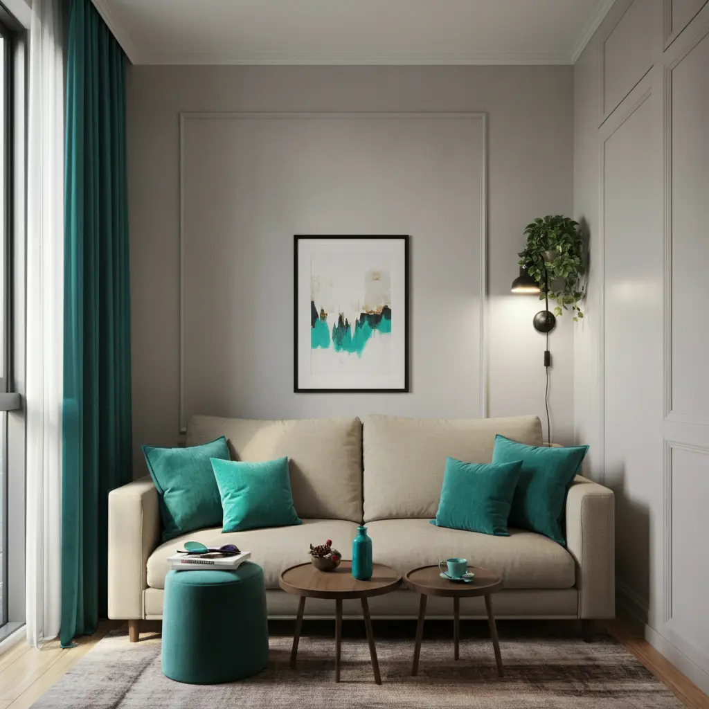
Strategic Use of Accent Colors
If you prefer a neutral backdrop but still crave a pop of color, an accent color scheme is the perfect solution. This allows you to inject personality and energy into the room without overwhelming the space.
The 60-30-10 Rule
A balanced color scheme often follows the 60-30-10 rule.
- 60% of the room should be your dominant, neutral color (e.g., the walls).
- 30% should be a secondary color (e.g., furniture, curtains, or an accent wall).
- 10% should be your accent color (e.g., throw pillows, artwork, or small decorative objects).
This formula ensures that the color is distributed in a way that feels harmonious and intentional.
High-Contrast Combinations
For a modern and dynamic look, pair a simple neutral base with a single, vibrant accent color. A living room with light gray walls, for example, could be energized with pops of sunny yellow or bold teal. This high-contrast look is visually exciting and draws attention to specific areas or objects, adding character and flair to your small space.
Conclusion
The color scheme of your small living room is a powerful tool for shaping its atmosphere. Whether you opt for light and airy neutrals to maximize brightness, serene monochromatic tones for a cohesive look, or daring dark colors for a cozy, dramatic feel, the right palette can make all the difference. Don’t be afraid to experiment with paint and accessories. By choosing colors that you love and that work with the space, you can create a small living room that is big on style and comfort.